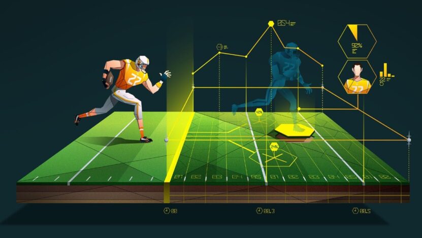
More than half of sports fans say visual graphics help them understand performance statistics better than raw numbers. That simple fact explains why sports analytics relies so heavily on clear charts and diagrams. Coaches, analysts, and journalists often need to communicate insights quickly, and good visuals make complex data easier to grasp at a glance.
Among the many forms of sports data visualization, pie charts remain both popular and controversial. Used well, they provide an immediate sense of proportion. Used poorly, they can distort interpretation and hide meaningful differences.
Understanding when pie charts in sports analytics make sense, and when they do not, helps avoid misleading conclusions while keeping the visualization of sports data clear and useful.
What Pie Charts Show in Sports Data
Pie charts display proportions of a whole. Each slice represents a category, and the full circle equals 100 percent. In sports analytics, that structure works best when categories clearly add up to a single total.
Many sports analytics tools include ready-made templates for creating charts quickly. Analysts often rely on tools that make visuals readable even for non-technical audiences. Using a pie chart generator with a modern, professional look can help maintain clarity and consistent formatting, especially when sharing reports with coaches or media teams.
Pie charts work best when data meets a few simple conditions:
- Categories must represent parts of a complete whole
- The number of slices should stay limited
- Differences between segments should be visually meaningful
When these conditions are met, pie charts can support performance statistics without overwhelming the viewer.
A pie chart is most effective when the audience needs to understand relative proportions rather than precise numerical differences.

Situations Where Pie Charts Make Sense
Not every dataset benefits from circular charts. Still, there are several areas where pie charts in sports analytics can communicate information quickly and clearly.
Analysts often use them to show distribution rather than trends or comparisons. When the goal is to understand how something is divided, pie charts remain practical.
Common examples include:
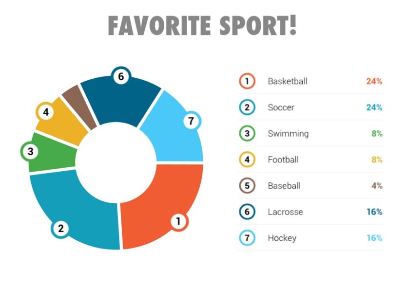
- Possession breakdown in football matches helps readers see which team controlled the game.
- Shot distribution by zone in basketball can show where most attempts originate.
- Scoring sources highlight whether points come from field goals, free throws, or fast breaks.
- Play type frequency reveals how often a team runs passing plays versus rushing plays.
These examples work because each category contributes to a total. The viewer understands the structure instantly, which is a major advantage of visualizing sports data with simple proportions.
Example Data Structure
|
Category |
Share |
| Two point shots | 48% |
| Three point shots | 32% |
| Free throws | 20% |
This kind of dataset translates naturally into a pie chart because all values represent portions of total scoring output.
Clear category boundaries keep interpretation simple and prevent confusion.
When Pie Charts Become Misleading
Despite their popularity, pie charts can easily become ineffective. Many sports graphics seen in broadcasts or articles suffer from poor design choices that reduce accuracy.
Pie charts struggle when viewers must compare similar values. Small differences between slices often appear larger or smaller than they actually are.
Several common scenarios cause problems:
- Too many categories create visual clutter and reduce readability.
- Similar percentages make it difficult to judge differences.
- Small slices become almost invisible on screens.
- Repeated comparisons across multiple teams force readers to mentally estimate values.
These limitations explain why sports data visualization experts often recommend alternative formats for analytical work. Precision matters when evaluating performance statistics, and pie charts rarely provide exact comparisons.
Did you know?
Research in visual perception consistently shows that people estimate lengths more accurately than angles, which explains why bar charts usually outperform pie charts in analytical tasks.
Common Mistakes in Sports Pie Charts
Poor implementation causes most problems with pie charts in sports analytics. Even useful datasets can become confusing when visual design is careless.
Some mistakes appear so often that experienced analysts recognize them immediately.
Typical issues include:
- Overloading charts with eight or more categories makes the graphic hard to read.
- Inconsistent color choices confuse viewers when comparing multiple charts.
- Missing labels force readers to guess percentages.
- 3D effects distort the size of slices and reduce accuracy.
- Charts that mix totals and averages create misleading interpretations.
Small design errors accumulate quickly. Even experienced analysts sometimes prioritize visual appeal over clarity, which leads to weaker communication.
A clean chart with five categories often communicates more effectively than a complex one with ten.
Better Alternatives for Sports Data Visualization
Pie charts serve a purpose, but many situations call for different formats. Choosing the right chart type often improves understanding more than refining a pie chart design.
Bar charts and line charts frequently provide clearer comparisons and trends.
The following options often work better:
- Bar charts make it easier to compare shooting percentages across players.
- Line charts show performance changes across a season.
- Stacked bars display category proportions while allowing comparison between teams.
- Heat maps reveal spatial performance patterns more effectively than circular charts.
Sports analytics tools usually offer multiple chart types for this reason. Analysts who switch formats when needed tend to produce clearer reports.
Bar charts remain especially useful when differences between categories matter more than overall proportion.

Practical Tips for Clear Sports Visualizations
Good sports data visualization balances simplicity with accuracy. Pie charts can support analysis if they remain focused and readable.
Analysts who follow a few practical guidelines tend to produce stronger visuals:
- Keep the number of slices between three and six whenever possible.
- Sort categories by size so the chart feels organized.
- Use consistent colors across related charts.
- Include percentages directly on the chart.
- Avoid decorative effects that distract from data.
Clear visuals help coaches and analysts understand performance statistics quickly without extra explanation.
Pie charts in sports analytics remain useful when used selectively. They communicate proportions effectively and work well in summaries and reports. Problems appear only when analysts rely on them for tasks better suited to other formats. Choosing the right visualization method ensures that sports analytics remains accurate, understandable, and genuinely useful.